Predicting Monthly CVE Disclosure Trends for 2024: A Time Series (SARIMAX) Approach
Published 01/19/2024
Written by Yamineesh Kanaparthy.
A Short Backstory
If you have clicked to read this, you might be familiar with CVEs already. If you are not, CVE stands for Common Vulnerability and Exposure. In simple terms, a security flaw. A unique Identifier called ‘CVE ID’ is assigned and published by the CVE Numbering Authorities for each identified flaw, making it easy for everyone to talk about and understand the flaw. Google Bard generated this analogy - Think of it like a doctor giving a name to a disease. Instead of calling it "that funny feeling in my tummy," it is now "appendicitis." The name makes it easier to diagnose and treat.
There are 234,202 CVEs in the National Vulnerability Database as I am writing this with more than 28,000 published in 2023 alone.
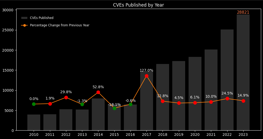
Figure 1. CVEs published by Year (2010-2023)
While the direction of growth in the future seems obvious, Forecasting can still be a valuable practice in any field to understand the trend and seasonality of occurrences. The number of CVEs published is a good indicator of the evolving threat landscape, but understanding the exploitability of CVEs is what will help organizations assess the risk and plan remedial actions. This article focuses on how a time series approach (SARIMAX model) can be used to predict the Monthly CVE counts for 2024.
Know the Data
I have used the NVD data feed v1.1 and excluded the Rejected CVEs. These counts could vary slightly depending on the source used. Data from Jan 2018 till Dec 2022 was used to train the model, Jan 2023 till Dec 2023, to test and Jan 2024 till Dec 2024, to forecast. For the overall period (2018 to 2023) selected for Modelling, the mean, median and quartiles were all close together, which suggests a symmetrical distribution. The IQR (Interquartile Range) is also less than 1.5 times the standard deviation, which means that there are no outliers. These are all signs that the distribution is likely normal. It just means the distribution and can be described by a bell curve. If these details interest you, be sure to check CVE ICU, a research project by Jerry Gamblin, who was also kindly helped me get started with this analysis.
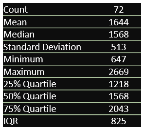
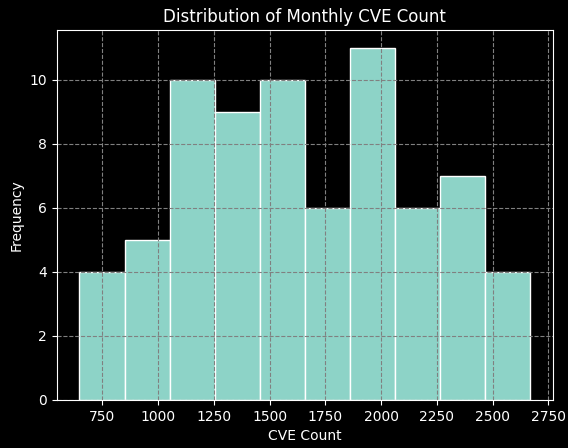
Figure 2. Monthly CVE Count Descriptive Statistics and Distribution (2016-2023)
Exploring Trends
Two areas of interest when exploring historical data are Seasonality and Trend Reversal.
Seasonality simply refers to recurring patterns at regular intervals. Trend Reversal refers to a change in the direction of a trend. There are three techniques that help effectively explore these.
ACF (Autocorrelation Function) Plot:
A plot that visualizes the correlation between a time series and lagged versions of itself at different time intervals called lags. It measures how much each observation is related to observations at previous time steps. In an ACF plot, the horizontal axis (lags) represents the time periods between the observation and its lagged version. The Vertical axis (correlation coefficients) ranges from -1 to 1, indicating the strength/ direction of the relationship. ‘Significant’ spikes suggest strong autocorrelation at those lags and ‘Gradual decay’ implies slow decay of autocorrelation over time.
Figure 3. Autocorrelation Function Plot
Here is what we can infer from the above plot,
Seasonality: There appears to be a strong seasonal pattern in the data, with peaks occurring every 12 months. This suggests that there are factors that influence the number of CVEs published that repeat on an annual basis.
Moderate autocorrelation: There is some correlation between the number of CVEs published in each month and the immediate previous month suggesting that the increase in CVE numbers is gradual, not sudden.
Decaying pattern: The autocorrelation seems to decay over time, meaning the influence of past months on the current month diminishes as the lag increases.
Polar Plot
A polar plot is a circle-based graph where data points are plotted by distance from the center and angle from a fixed direction.
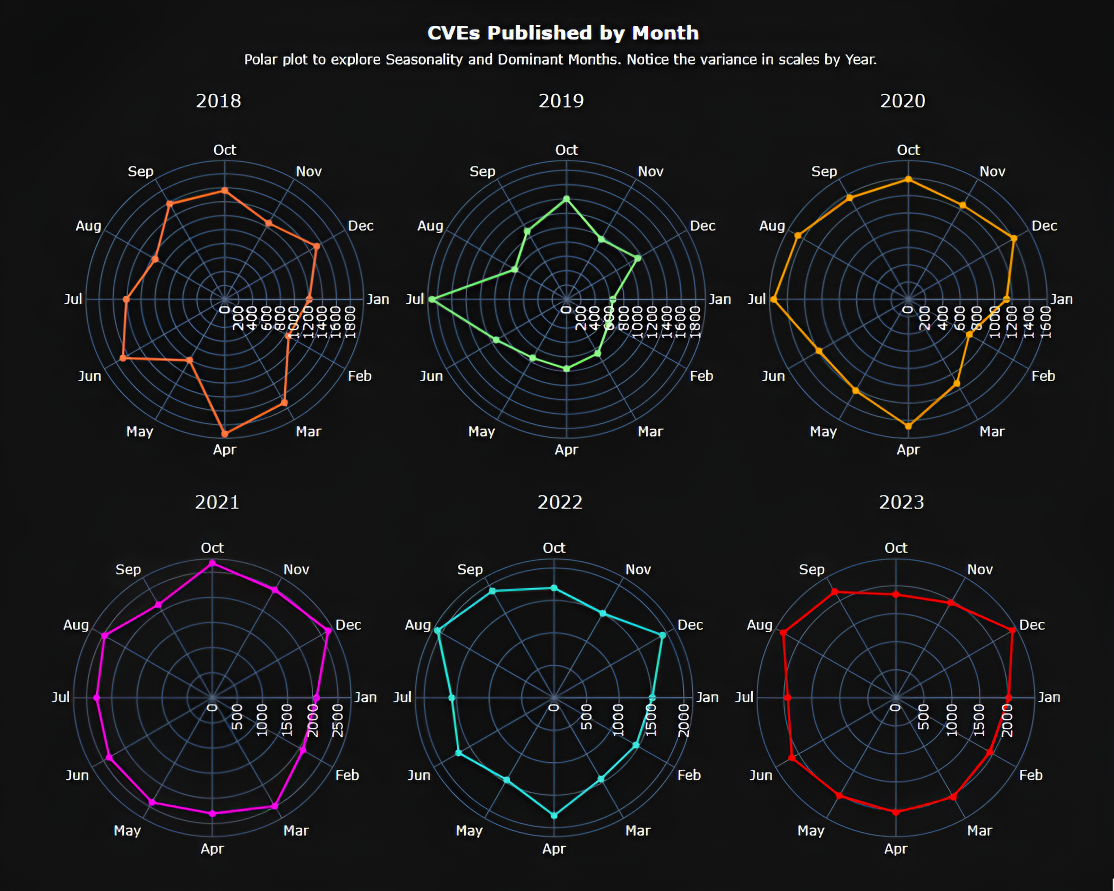
Figure 4. Circular Polar Plot by Year (2016- 2023)
Apart from the upward trend that we already know from the start, we can observe a clear seasonal pattern, with peaks typically occurring in the spring (April-May) and fall (October-November). This suggests that factors influencing CVE publication repeat around these times each year with a potential trend reversal in 2023, which shows a noticeably lower peak in the spring and a flatter overall trend. This suggests a possible break in the seasonal pattern but to conclude the reversal, we need to continue observing the data for 2024 and beyond.
Decomposition Plot
A decomposition plot slices the data into different pieces, revealing the hidden patterns and trends shaping the overall picture. The key components are,
Original Series: The raw data we want to decompose, plotted over time.
Trend Component: Represents the long-term, underlying tendency of the data, capturing gradual increases or decreases.
Seasonal Component: Captures any recurring patterns that repeat within a specific period, like months or quarters, often seen as waves or peaks and valleys.
Residuals: The leftover pieces after removing the trend and seasonality, representing any remaining random fluctuations or irregularities.
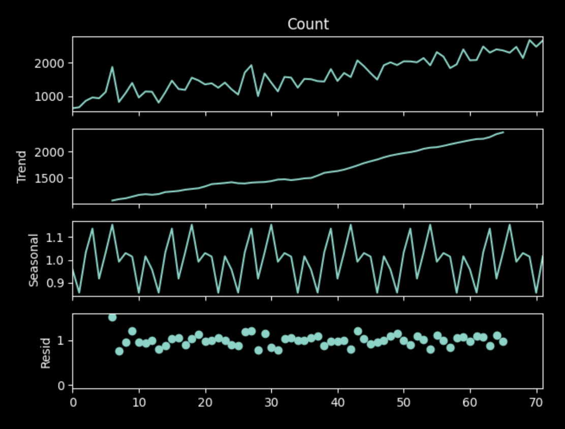
Figure 5. Multiplicative Decomposition Plot
Consistent with the previous plots, we can also observe a clear and strong seasonal pattern in the decomposition plot, with peaks typically occurring in April-May and October-November, and troughs in January-February and July-August. This pattern remains relatively stable across the 6-year period. This plot uses multiplicative decomposition, and the residual component shows some random fluctuations but no clear patterns, indicating that the multiplicative decomposition model effectively captures most of the seasonality and trend in the data.
What's SARIMAX?
Imagine planning a hike with your friends who are first time hikers, and you are the designated experienced guide they trust. You would not want to depend on luck. You would do your research and factor in various details to ensure a smooth, enjoyable trek. Similarly, SARIMAX is a powerful forecasting technique which combines different elements to predict future values in time series data.
SARIMAX stands for Seasonal Autoregressive Integrated Moving Average Exogenous. Here is how a SARIMAX model to plan your hike would look like –
Check the Hiking Trail History (Past Values (AR)):
Just like you would recall your past experiences on similar trails, the AR (Autoregressive) component of SARIMAX analyzes past data points. Did it rain last time you hiked in this area? Were there high winds in the afternoon? AR considers these historical patterns to predict future trends based on what has come before.
Check the Calendar (Seasonal Patterns (SARIMA)):
Remember when everyone decides to go hiking during holidays or long weekends? The trails get crowded, affecting your experience. That is where the SARIMA (Seasonal) component comes in. It identifies and accounts for recurring patterns like seasonal trends, holidays, ensuring the prediction best adapts to these fluctuations.
Checking the Weather Report (Surprises (MA)):
Even the best plans can be disrupted by unexpected events. A sudden downpour or unexpected trail closure can throw your hike off track. The MA (Moving Average) component acts like your weather report. It analyzes recent data for short-term fluctuations and "surprises" that might deviate from the usual patterns, allowing you to adjust your predictions and stay flexible.
Read the News and Trail Updates (External Influences (X)):
Sometimes, factors beyond your control can impact your hike. Maybe there is a recent wildfire that affects air quality, or a section of the trail is closed for maintenance. The X (Exogenous) component allows SARIMAX to incorporate these external influences into its predictions, adding another layer of accuracy.
Just like you use your knowledge and research to plan the perfect hike for your friends, SARIMAX combines all the above elements of a Time Series data and helps make informed predictions. Time Series Analysis and Its Applications and What Is a SARIMAX model are great resources to deep dive into the topic and the math behind SARIMAX.
Choosing the Evaluation Metric
The best metric is the one that helps make the right decision. You have probably heard this already. Here is how we apply this. RMSE (Root Mean Square Error) and MAPE (Mean Absolute Percentage Error) are two commonly used metrics to evaluate a Time Series Model. Understanding the data and context is what helps decide the best Metric for Modeling.
RMSE penalizes large errors more heavily and is useful for data with moderate range, (like the CVE data) and no outliers. MAPE, on the other hand, presents errors as percentages, making it scale-dependent. This means, in our case, with a data range between 650 and 2879, a small absolute error at the lower end of the range would have a much larger percentage impact on MAPE compared to the same error at the higher end. MAPE also tends to penalize over-predictions more heavily than under-predictions. This can lead to the model being optimized to consistently under forecast, which may not be desirable as this could distort the true picture of forecast accuracy. Considering this understanding, RMSE seems like a more suitable Evaluation Metric for this time series model.
Model Performance
Grid search is a popular approach to search for the best hyperparameters for a Machine Learning model. Using this and the observations (we know the seasonality is annual and there is an influence of the immediate previous month) from the different plots we used to explore, we can search for the best parameters that return the optimal RMSE. These were the best parameters,
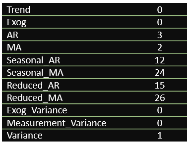
Figure 6. Best Model Parameters
In short, the best Time Series model to predict CVEs for 2024 is the one that relies on the last 3 months (adjusts for recent shocks), and heavily considers seasonality (An Annual cycle). The model's RMSE was 191, suggesting that the model's predictions are within about 191 units of the true values.
Prediction for 2024
This is what you are most interested in knowing. The Monthly predictions for published CVE counts using the Time Series Model with the best hyperparameters are as below,
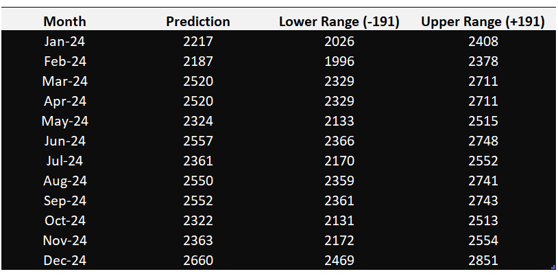
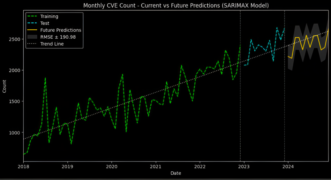
Figure 7. Monthly Predictions for 2024 (above) and Training, Test and Predictions with Error Interval (below)
Conclusion and Takeaway
While this model provides a valuable roadmap for potential CVE trends in 2024, it is crucial to view it only as a tool. We should also remember, a machine learning model is not a crystal ball, but a dynamic guide. The model performance needs to be continuously monitored and fed fresh data to refine the predictions. Statistical patterns only tell part of the story. To understand the "why" behind these trends, we need OSINT investigations to uncover the human factors at play, like major software releases, hacker activity patterns, and even unexpected geopolitical events.
But even with this deeper understanding, prioritizing the response requires a more targeted approach. By leveraging scoring systems like EPSS, sources like KEV, and CVE Exploitability Scores, we can prioritize which vulnerabilities demand immediate action and allocate resources effectively.
The python code for the modeling and visualization is published to the Project GitHub Repository.
About the Author

Yamineesh Kanaparthy is a Data Scientist with extensive experience in implementing Analytics and Reporting in Cybersecurity among other areas. He also has more than a decade of experience in Enterprise IT Infrastructure. Yamineesh also holds a Master's degree, specializing in Security Analytics from CU Boulder. Reach out to him on LinkedIn for any questions/feedback.
Peer Reviewed By

Satish Govindappa is a highly accomplished professional with an extensive background in cloud security and product architecture. With over two decades of experience, Satish has established himself as a prominent figure in the industry, serving as a Board Member and Chapter Leader for the Cloud Security Alliance SFO Chapter.
He holds a master's degree in computer applications (MCA), specializing in cybersecurity and cyber law. Additionally, Satish has earned a Master of Business Administration (MBA) degree, further enhancing his expertise in the intersection of technology and business strategy.
His expertise lies in designing, architecting, and reviewing both cloud and non-cloud products and services. Satish has a proven track record of successfully implementing.
References
Hyndman, R. J., & Athanasopoulos, G. (2018). Forecasting: Principles and Practice (3rd ed).
Box, G. E., Jenkins, G. M., Reinsel, G. C., & Ljung, G. M. (2015). Time Series Analysis. John Wiley & Sons.
Cryer, J. D., & Chan, K. S. (2008). Time series analysis with applications in R. Springer Texts in Statistics.
Nicolas Vandeput]. (2019, July 5). Forecast KPIs: RMSE, MAE, MAPE & Bias.
NIST. (2023, November 6). Vulnerability Metrics. NVD. https://nvd.nist.gov/vuln-metrics/cvss
Share this content on your favorite social network today!
%20(1).jpg)

.png)


Unlock Cloud Security Insights
Subscribe to our newsletter for the latest expert trends and updates
Related Articles:
AI Security Asymmetry: Why Speed Alone Won't Save Defenders
Published: 07/03/2026

Validating LLM-Generated Control Mappings Beyond Aggregate Accuracy
Published: 07/02/2026

AI-Speed Risk Requires Identity-Defined Reachability
Published: 07/02/2026

Proof is the Application Security Bottleneck
Published: 07/01/2026